

Project Overview
When I joined the WCT Pay project, the core challenge wasn’t just designing screens — it was making sense of a system that most users don’t fully understand. Crypto payments, fiat settlements, invoicing, payouts — all of these existed, but they were fragmented. Merchants had to mentally connect multiple steps, often across different tools. The goal was simple on paper:
But in reality, this meant solving one of the hardest UX problems in fintech: making invisible financial complexity feel simple and trustworthy.
Understanding the Problem
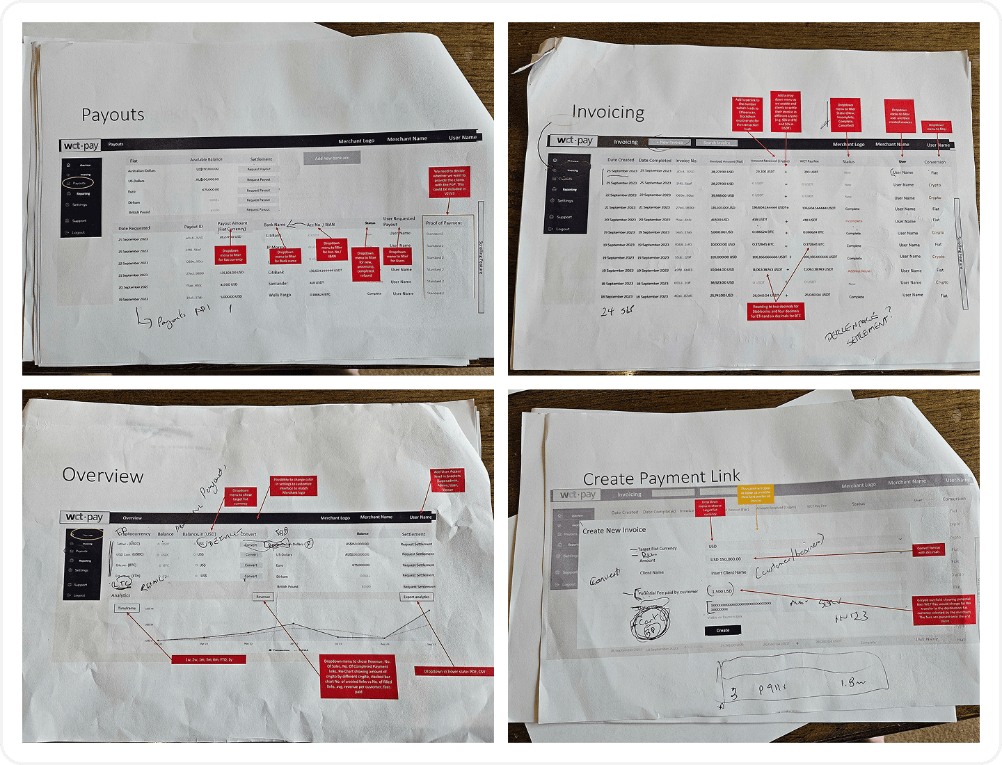
At first, it looked like a typical fintech system: multiple flows, multiple features, multiple data points. But after going through the product more carefully, I realized the issue wasn’t about what was missing.
It was about how everything was connected
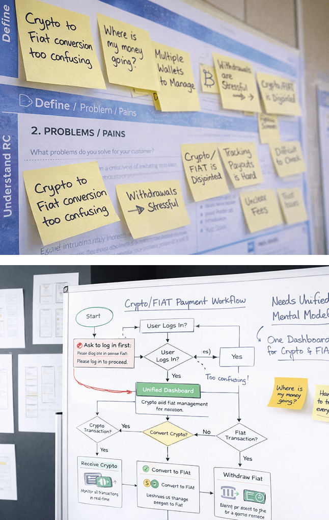
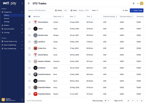
From a user’s perspective, the experience wasn’t one journey — it was several disconnected steps. And worse, users had to think in two different mental models at the same time: Crypto… and fiat.
The system expected them to translate between the two, understand where their money was, and make decisions confidently — all without enough clarity.
That gap is subtle, but critical. Because in financial products, confusion doesn’t just slow users down. It breaks trust.
Reframing the Product
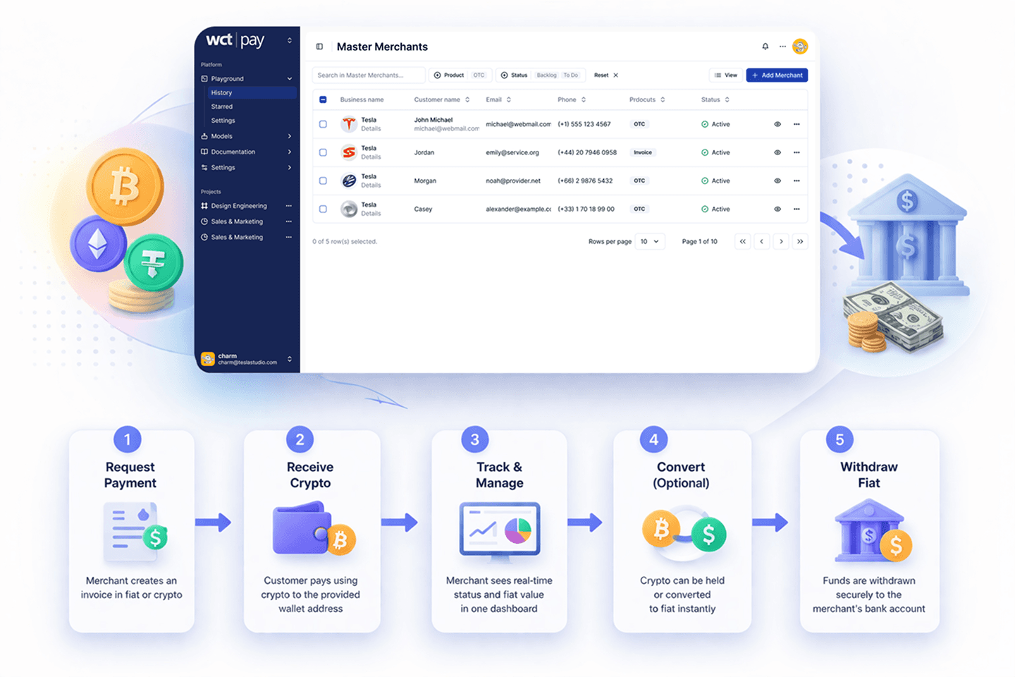
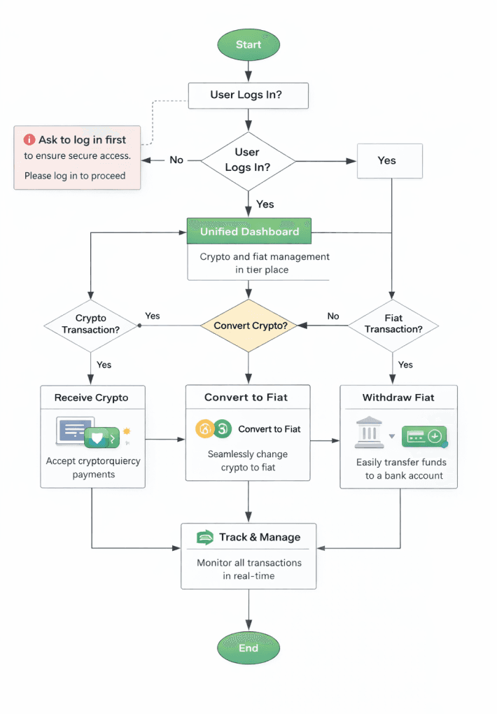
Instead of starting with UI, I stepped back and reframed the problem: This isn’t a dashboard. It’s a money lifecycle.
Every action — whether it’s invoicing, receiving funds, or withdrawing, is just part of one continuous journey:
That shift changed everything.
Instead of designing separate features, I focused on making the flow between them feel seamless and predictable.
Design Principle: Reduce Thinking
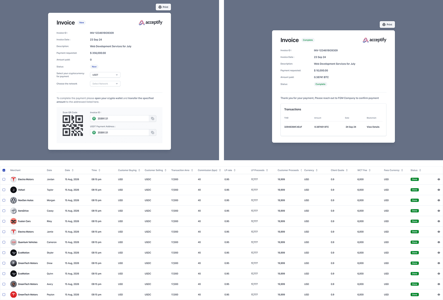
The biggest opportunity wasn’t adding anything new. It was removing the need for users to think too much. One clear example was how balances were presented, users could see multiple currencies and tokens, but that didn’t answer their real question:
So I changed the perspective.
Instead of showing crypto and fiat as separate concepts, the system translates everything into value. Users still see what they hold, but more importantly, they understand what it means.
It’s a small shift — but it removes constant mental calculation.
And that’s where clarity starts.
Designing for Trust Moments
Not every part of the product carries the same weight.
Some moments matter more than others. I focused heavily on the moments where users feel the most uncertainty:
- When they receive payment
- When they send money
- When they withdraw funds
These are not just interactions, they are trust moments.
Instead of optimizing for speed or visual complexity, I made sure these moments feel clear, controlled, and intentional.
Sometimes that meant simplifying the interface. Sometimes it meant adding friction — like confirmation steps — to help users feel more confident before completing an action.
Because in fintech, fast doesn’t always mean good. Confident does.
From Tool to System
As the structure became clearer, the product naturally shifted. It stopped feeling like a collection of features and started behaving like a system. Everything connected back to the same goal: helping users move and manage money without confusion. That alignment made the experience more predictable, and more importantly, more trustworthy.
What I Learned
This project changed how I approach complex products.
I learned that clarity doesn’t come from simplifying the system itself — it comes from simplifying how users experience it.
It’s not about removing complexity, It’s about absorbing it into the design so users don’t have to.
Reflection
If I look back, the most important shift wasn’t visual.
It was structural. Once the product was reframed as a single lifecycle instead of separate features, the design decisions became much more obvious.
And that’s something I carry forward: Good product design isn’t about adding more.It’s about making everything feel connected, clear, and reliable.